StylishWidget
StylishWidget is a library for an Android Application project to make the UI more beautiful and allow to use third party font. This library also contain few view that created by me and, I use it in my previous and current android project and may got an issue and error. I will keep improve this library until it stable and useful.
New update
- Bootstrap 4 color scheme
- Add Field for Custom Bold Italic Font
- Meter added
- custom declare-styleable prefix added
Features
- set custom font for almost all view.
- Message Box
- Progress Bar
Android 7.0+ support
Download
- JAR : ( https://github.com/shiburagi/Stylish-Widget-for-Android/tree/master/stylishwidget/jar)
- APK : ( https://drive.google.com/file/d/0Bw_drx3o3plaZVptWWNxWUdfSmM/view?usp=sharing)
Including In Your Project
This library is presented as a .jar file which you can include in the libs/ folder of your application. You can download the latest version from the github repo.
If you are a Maven user you can easily include the library by specifying it as a dependency:
Maven
<dependency>
<groupId>com.app.infideap.stylishwidget</groupId>
<artifactId>stylish-widget</artifactId>
<version>1.3.9</version>
<type>pom</type> </dependency>
Gradle
dependencies {

 compile 'com.app.infideap.stylishwidget:stylish-widget:1.3.9'
}
or, you can include it by download this project and import /stylishwidget as module.
Usage
NOTE: If you want to use third-party font, must initialize this line of code at the top of onCreate() in main activity, or at the onCreate() of Custom Application.
// parameter : Normal Font, Bold Font and Italic Font String fontFolder = "Exo_2/Exo2-"; Stylish.getInstance().set(

  fontFolder.concat("Regular.ttf"),

  fontFolder.concat("Bold.ttf"),

  fontFolder.concat("Italic.ttf"));
or
// parameter : Normal Font, Bold Font, Italic Font and Bold Italic Font String fontFolder = "Exo_2/Exo2-"; Stylish.getInstance().set(

  fontFolder.concat("Regular.ttf"),

  fontFolder.concat("Bold.ttf"),

  fontFolder.concat("Italic.ttf"),

  fontFolder.concat("BoldItalic.ttf"));
or
String fontFolder = "Exo_2/Exo2-"; // parameter : Normal Font Stylish.getInstance().setFontRegular(

  fontFolder.concat("Regular.ttf") );
 // parameter : Bold Font Stylish.getInstance().setFontBold(

  fontFolder.concat("Bold.ttf") );
 // parameter : Italic Font Stylish.getInstance().setFontItalic(

  fontFolder.concat("Italic.ttf")) );
 // parameter : Bold Italic Font Stylish.getInstance().setFontBoldItalic(

  fontFolder.concat("BoldItalic.ttf")) );
Widget
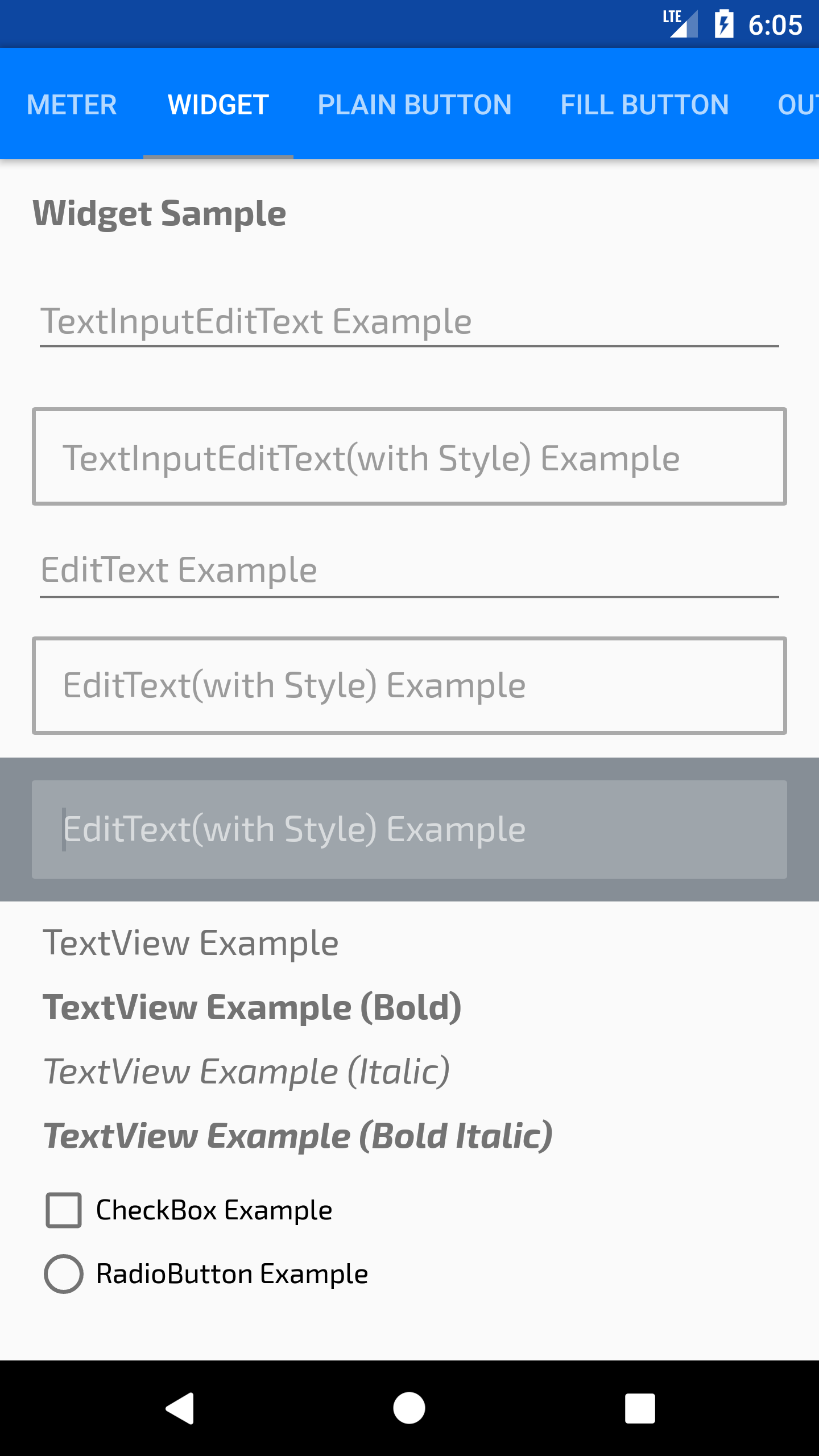
to use the widget, is same like using android widget
EditText
<com.app.infideap.stylishwidget.view.AEditText android:layout_width="match_parent" android:layout_height="wrap_content" android:hint="@string/editextexample" />TextView
<com.app.infideap.stylishwidget.view.ATextView android:layout_width="match_parent" android:layout_height="wrap_content" android:paddingLeft="5dp" android:paddingRight="5dp" android:text="@string/textviewexamplebold" android:textAppearance="@style/TextAppearance.AppCompat.Medium" android:textStyle="bold" />CheckBox
<com.app.infideap.stylishwidget.view.ACheckBox android:layout_width="wrap_content" android:layout_height="wrap_content" android:text="@string/checkboxexample"/>RadioButton
<com.app.infideap.stylishwidget.view.ARadioButton android:layout_width="wrap_content" android:layout_height="wrap_content" android:text="@string/radiobuttonexample"/>Button
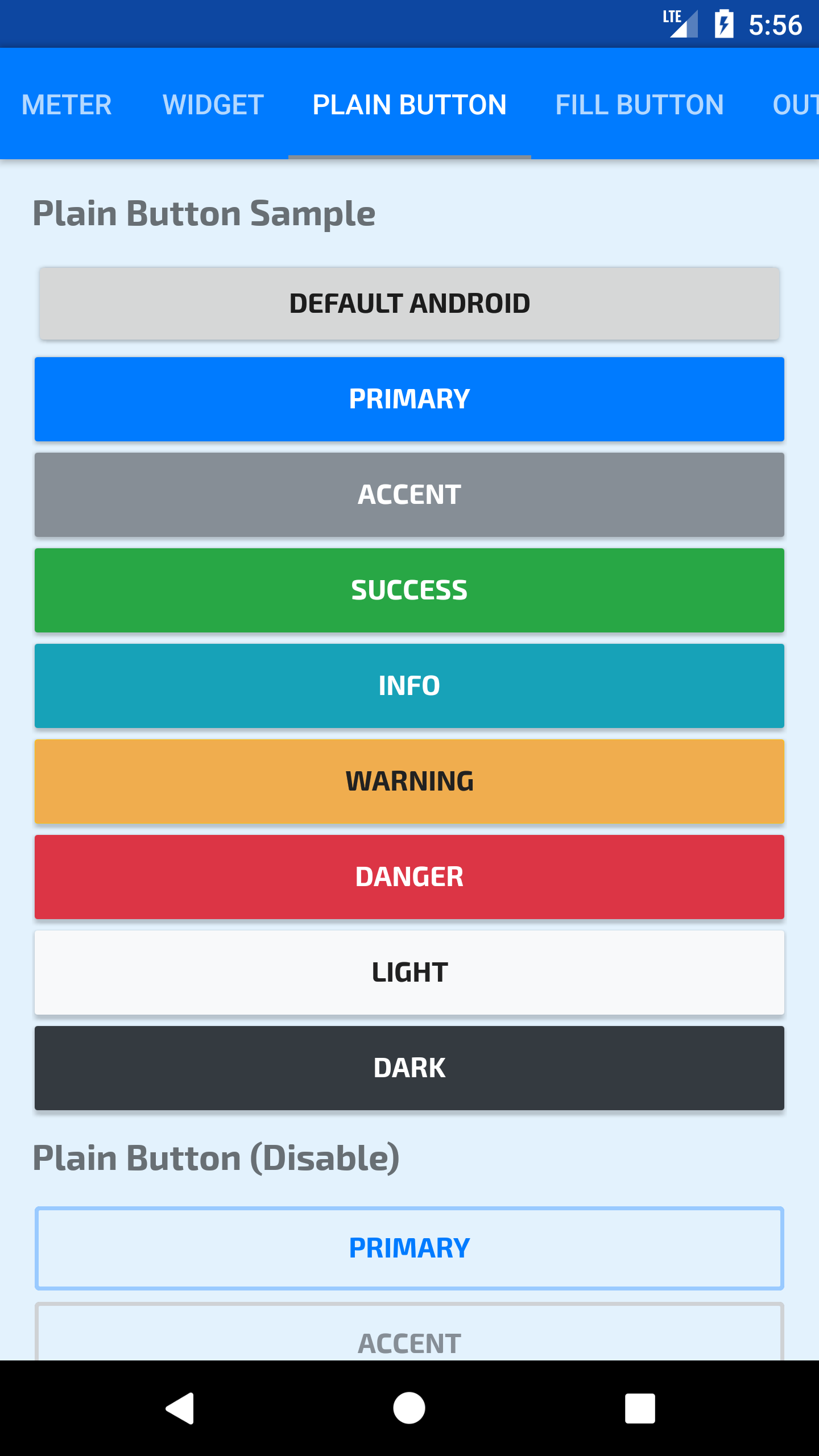
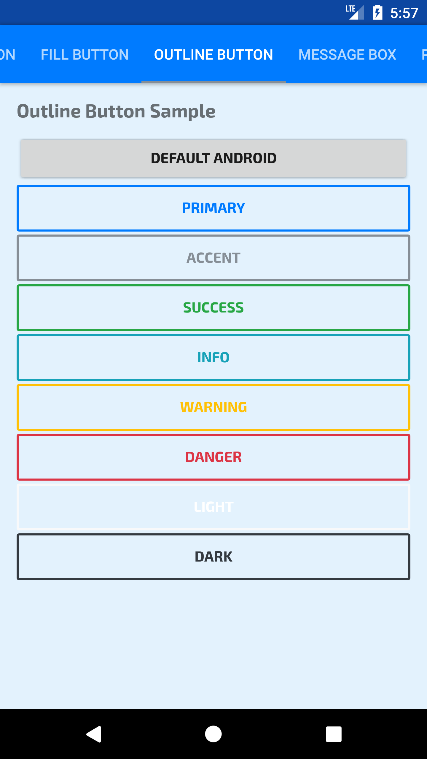
<com.app.infideap.stylishwidget.view.AButton style="@style/Button.Default" android:layout_width="match_parent" android:layout_height="wrap_content" android:text="Default" />Message Box
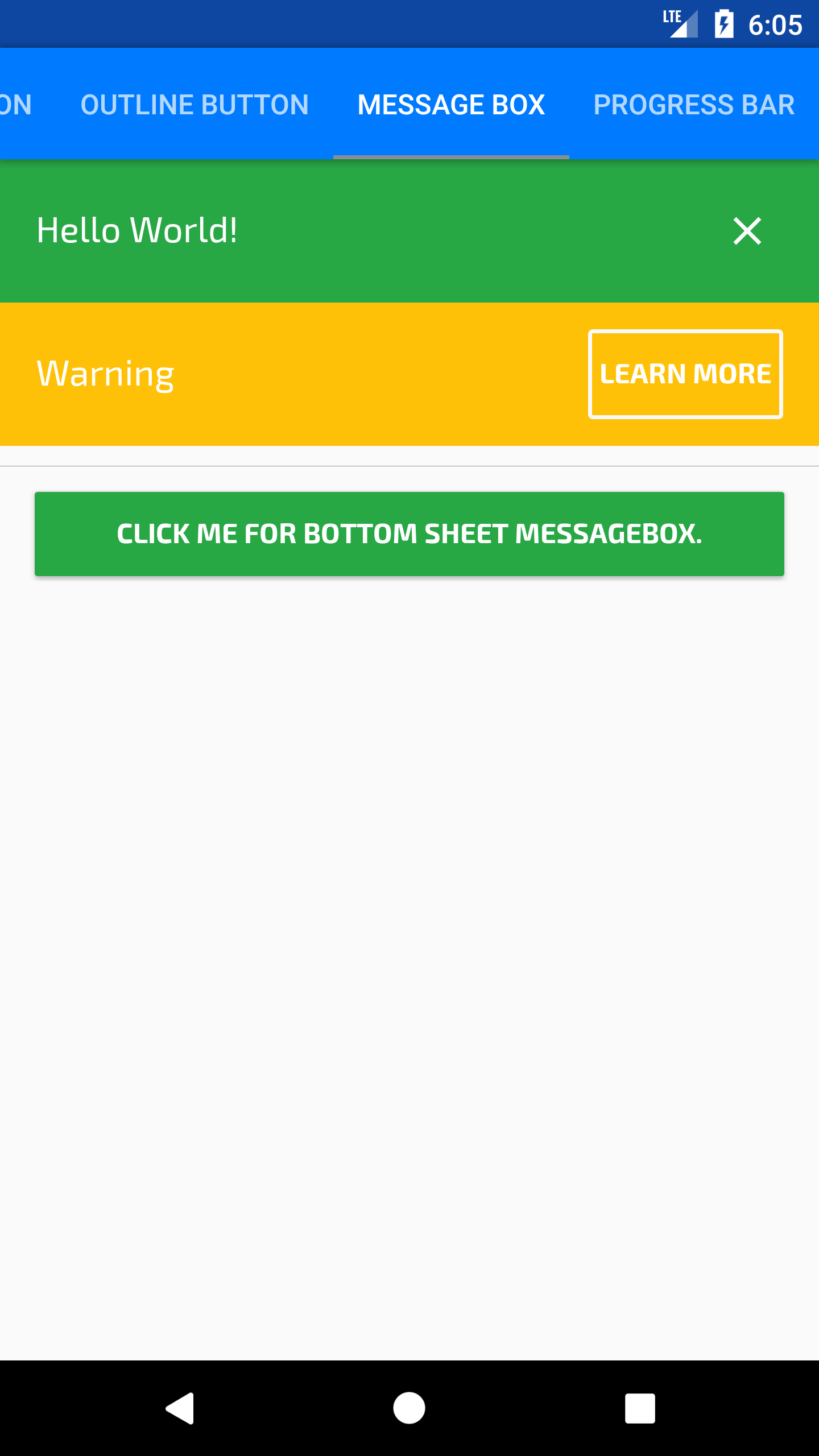
<com.app.infideap.stylishwidget.view.MessageBox android:id="@+id/message_info" android:layout_width="match_parent" android:layout_height="wrap_content" app:sw_boxBackground="@color/colorSuccess" app:sw_message="@string/helloworld" />for the MessageBox, there are several new declare-styleable need to highlight,
- app:sw_boxBackground - to set background color, only color allow.
- app:sw_message - to set display text.
- app:sw_textStyle - to set textView style, (normal, bold, italic).
- app:sw_innerPadding - to set inner padding of message box.
- app:sw_innerLeftPadding - to set inner left padding of message box.
- app:sw_innerTopPadding - to set inner top padding of message box.
- app:sw_innerRightPadding - to set inner right padding of message box.
- app:sw_innerBottomPadding - to set inner bottom padding of message box.
- app:sw_drawable - to set textView drawable.
- app:sw_drawablePadding - to set padding of textView drawable.
and for MessageBox there are two kind of listener or action mode,
- CloseButton, display as close icon
infoMessageBox.setCloseButton(new View.OnClickListener() {

@Override
public void onClick(View v) {

 AlertDialog dialog = new AlertDialog.Builder(MainActivity.this)

.setMessage("Close Button Click!").create();

 dialog.show();

  infoMessageBox.setVisibility(View.GONE);

}

}
);
- ActionButton, display as outline button with a text
warningMessageBox.setActionButton(R.string.learnmore, new View.OnClickListener() {

  @Override
  public void onClick(View v) {

AlertDialog dialog = new AlertDialog.Builder(MainActivity.this)

  .setMessage("Warning Action Click!").create();

dialog.show();


}

}
);
however, only one action can be use for a MessageBox
Progress Bar
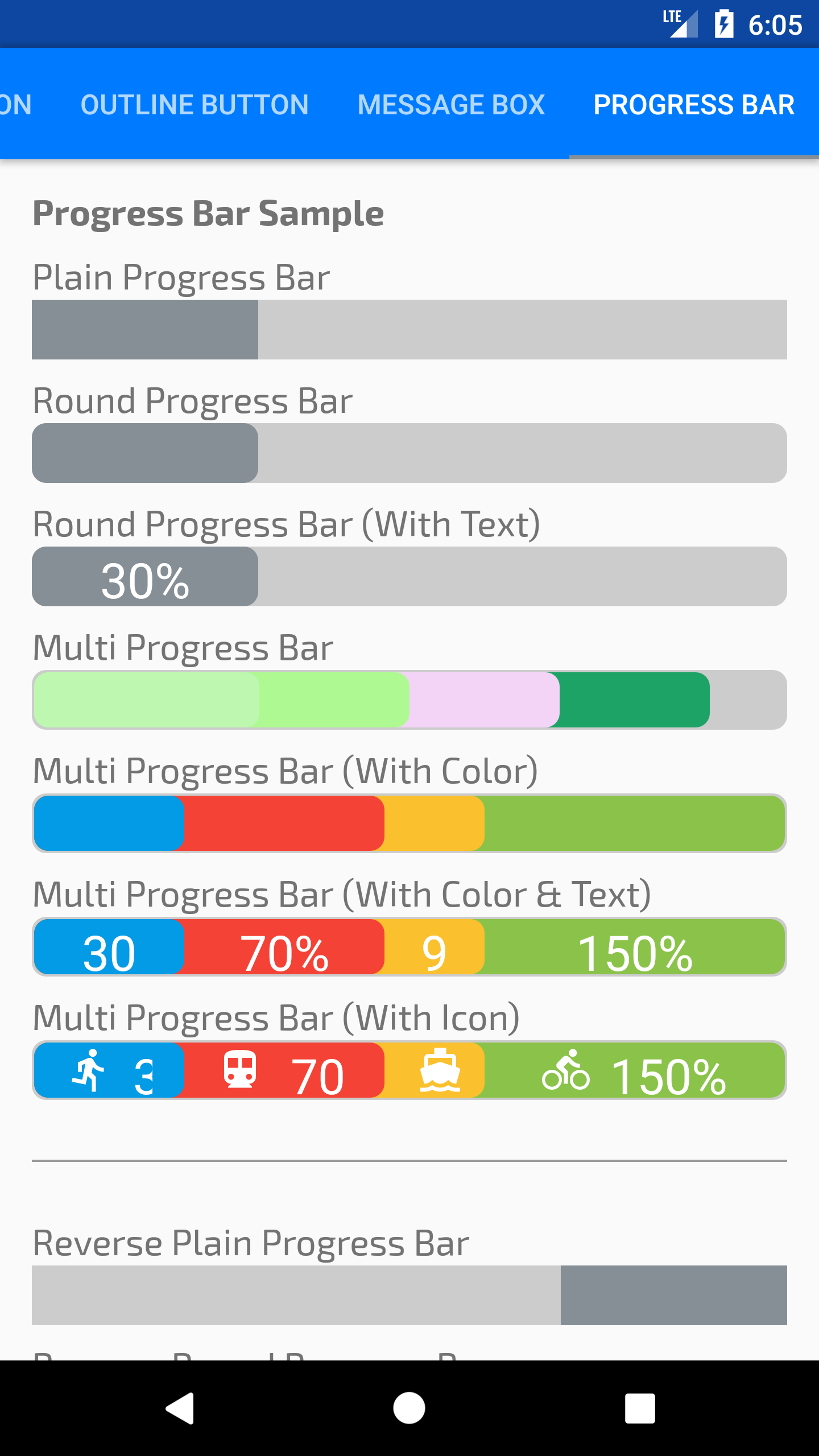
Sample code (XML):
 <com.app.infideap.stylishwidget.view.AProgressBar

 android:layout_width="match_parent"

 android:layout_height="30dp"

 app:sw_maxValue="100"

 app:sw_progressBackground="#ccc"

 app:sw_progressColor="@color/colorAccent"

 app:sw_progressText="30%"

 app:sw_progressTextStyle="bold"

 app:sw_progressValue="30"

 app:sw_radius="7dp"

 app:sw_withAnimation="true" />
Here the list of available attributes for progress bar,
<attr name="sw_maxValue" format="float" /> <attr name="sw_progressValue" format="float" /> <attr name="sw_radius" format="dimension" /> <attr name="sw_progressColor" format="color" /> <attr name="sw_progressText" format="string" /> <attr name="sw_progressTextSize" format="dimension" /> <attr name="sw_progressTextStyle" format="enum">
<enum name="normal" value="0" />
<enum name="bold" value="1" />
<enum name="italic" value="2" /> </attr> <attr name="sw_progressPadding" format="dimension" /> <attr name="sw_progressIconPadding" format="dimension" /> <attr name="sw_withAnimation" format="boolean" /> <attr name="sw_duration" format="integer"/> <attr name="sw_progressTextAppearance" format="reference"/> <attr name="sw_progressBackground" format="color"/> <attr name="sw_progressIcon" format="reference"/>
and, here the list of all declare function in AProgressBar class,
setProgressBackground(int color) getProgressValue() getProgressValue(int index) setPadding(int padding) setMaxValue(float value) setProgressValue(float value) setProgressValue(int index, float value) setProgressValues(float ...values) addProgressValue(float value) addProgressValue(float value, int color) removeProgressValue(int index) setProgressColor(int color) setProgressColor(int index, int color) setProgressColors(int ...colors) setProgressValueWithColor(int index, float value, int color) setProgressText(int resId) setProgressText(String text) setProgressText(int index, int resId) setProgressText(int index, String text) setProgressTexts(int ...resId) setProgressTexts(String ...texts) setProgressValueAndText(int index, float value, int resId) setProgressValueAndText(int index, float value, String text) setProgressIcon(int resId) setProgressIcon(Drawable icon) setProgressIcon(int index, int resId) setProgressIcon(int index, Drawable icon) setProgressIcons(int ...resId) setProgressIcons(Drawable ...icons) setGravity(int gravity) withAnimation(long duration) setProgressTextStyle(int textStyle) setProgressTextAppearance(int resId) setProgressIconPadding(int padding)Example for multiple progress bar,
AProgressBar iconMultiProgressBar =

(AProgressBar) view.findViewById(R.id.progressBar_multi_icon);
 iconMultiProgressBar.setProgressValues(

30,

150,

90,

70);
  iconMultiProgressBar.setProgressColors(

Color.parseColor("#039BE5"),

Color.parseColor("#8BC34A"),

Color.parseColor("#FBC02D"),

Color.parseColor("#f44336"));
  iconMultiProgressBar.setProgressTexts(

"30%",

"150%",

"90%",

"70%" );
 iconMultiProgressBar.setProgressIcons(
  R.drawable.ic_directions_run_white_24dp,
  R.drawable.ic_directions_bike_white_24dp,
  R.drawable.ic_directions_boat_white_24dp,
  R.drawable.ic_directions_subway_white_24dp );
  iconMultiProgressBar.setMaxValue(100);
 iconMultiProgressBar.withAnimation(1000);
For more progress bar example, please refer on the link below :
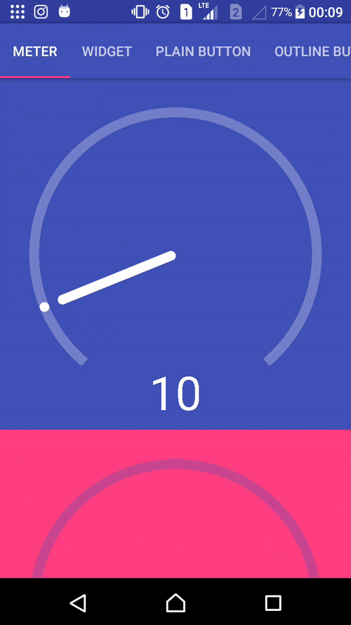
Meter
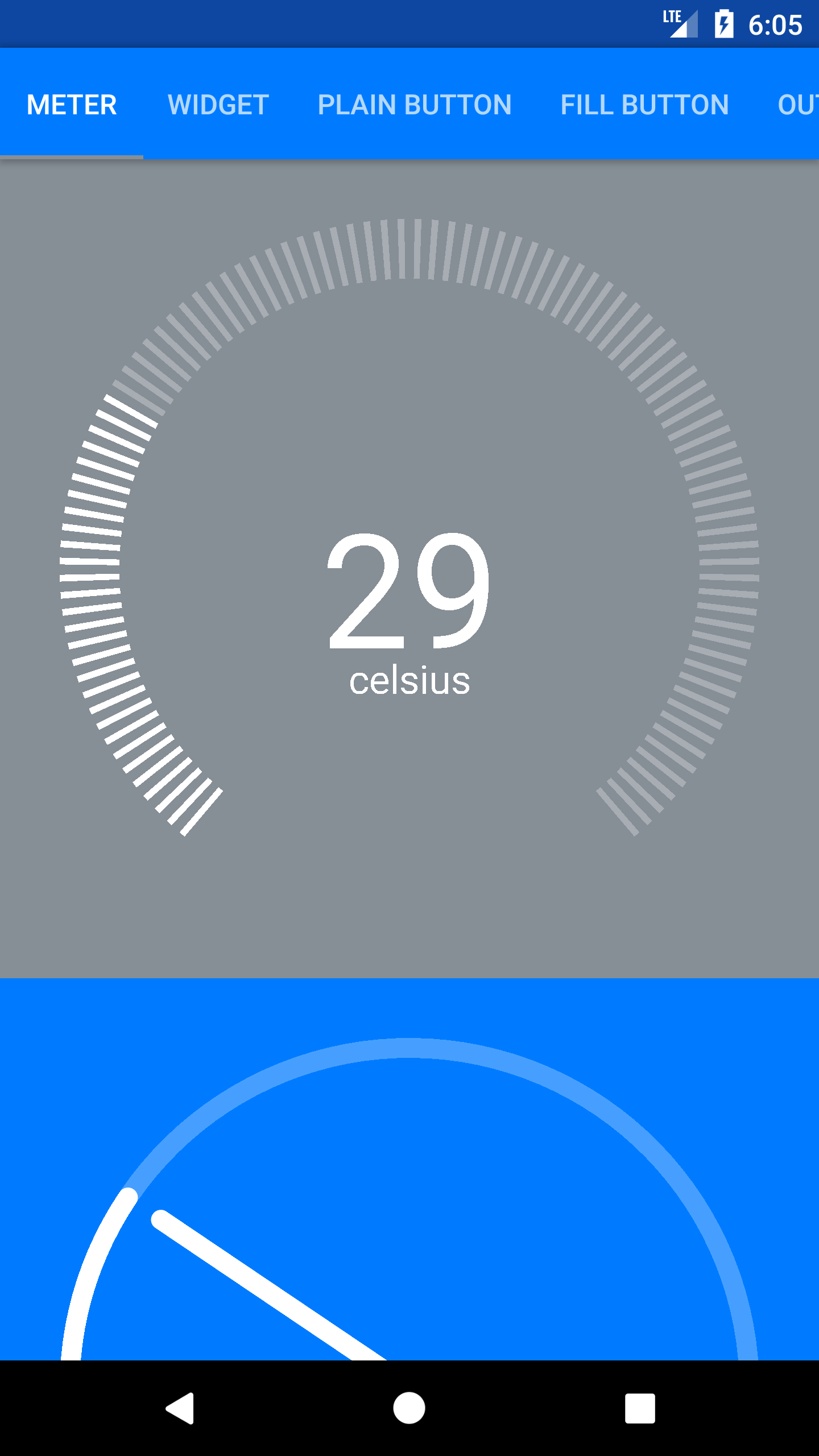
Sample code (XML):
 <com.app.infideap.stylishwidget.view.AMeter

 android:id="@+id/meter"

 android:background="@color/colorPrimary"

 android:layout_width="match_parent"

 android:layout_height="wrap_content"

 android:layout_gravity="center"

 app:sw_maxValue="10"

 app:sw_meterColor="@color/colorWhite"

 app:sw_showText="true"

 app:sw_value="8" />
here the list of all declare function in IndicatorTabLayout.IndicatorTab class,
setValue(float) : void setMaxValue(float) : void setMeterColor(int) : void setTextStyle(int) : void setTextSize(float) : void setShowText(boolean) : void getValue(int) : float getMaxValue() : float getMeterColor() : int isShowText() : intExample for Meter,
AMeter meter = (AMeter) view.findViewById(R.id.meter);
 meter.setMaxValue(100);
For more Meter, please refer on the link below :
Contact
For any enquiries, please send an email to [email protected].
License
Copyright 2016-2017 Shiburagi  Licensed under the Apache License, Version 2.0 (the "License");
 you may not use this file except in compliance with the License. You may obtain a copy of the License at
  http://www.apache.org/licenses/LICENSE-2.0  Unless required by applicable law or agreed to in writing, software distributed under the License is distributed on an "AS IS" BASIS, WITHOUT WARRANTIES OR CONDITIONS OF ANY KIND, either express or implied. See the License for the specific language governing permissions and limitations under the License.